

American Built Websites
for the American Dream.
More Jobs. No Tech. No BS.
A top digital firm helping businesses across the States go live, grow fast, and win online. We don’t just build websites — we build scalable growth systems. Using the best technology, proven marketing, and real strategies designed to get your phone ringing.


We Don’t Just Build Websites We Build Growth Systems.
WEB DESIGN & DEVELOPMENT
PAID ADVERTISING
SEARCH ENGINE OPTIMIZATION
SOCIAL MEDIA MANAGEMENT
Built for Every Trade That Builds America

UNLIMITED REVISIONS. UNLIMITED UPDATES.
We’ll keep rebuilding your website until you love it.
We don’t stop until you’re 100% satisfied with the final result.
We’re always available for unlimited website updates.
Here’s How It Works

Book a Quick Call
We’ll ask a few simple questions about your business, goals, and what you want to achieve no tech talk, no BS.

We Build Your Website the Right Way
Our team designs and develops a fully branded, mobile-optimized, and conversion-focused website that represents your business at its best.

You Go Live + We Help You Grow
Once your site is live, we help you drive real traffic and clients through targeted marketing and paid ad campaigns — so your new website actually generates business.
See what your
website could look alike
We don’t just build websites, we build growth systems.
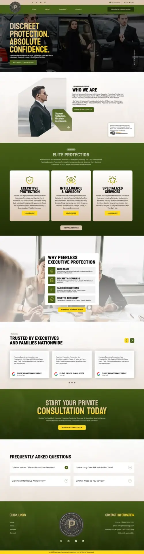
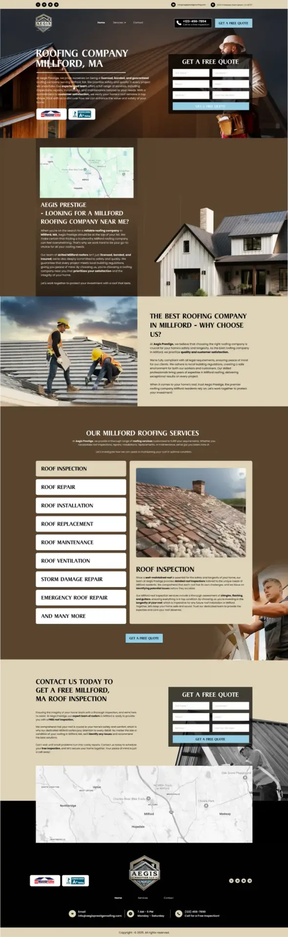
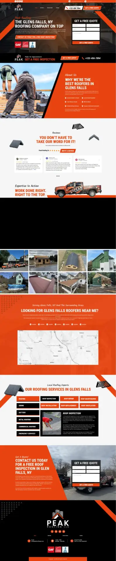
Explore some of the businesses we’ve helped go from invisible online to fully booked and thriving. All sites are clean, fast, mobile-friendly, and built to convert.







We Build Custom Websites Designed Around Your Business.
it always ends up looking cheap, generic,
and not built by a pro.
your site is crafted specifically for your business.
What works for a contractor
won’t work for a law firm.
mobile-friendly, and built to convert.
Built Here. By Americans. For American Businesses.
by skilled professionals
right here in the United States.
you’ll find online…
craftsmanship, quality,
and the American standard of work.
Built with integrity.
Delivered with pride.
IMAGINE WHAT’S POSSIBLE HERE’S WHAT OTHERS HAVE ACHIEVED

1 year ago


1 year ago

1 year ago

1 year ago

1 year ago

1 year ago
1 year ago
1 year ago
1 year ago

Case Study
Proof That It Works. Every Time
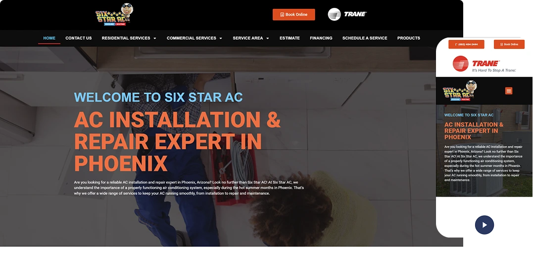
Before
- Generic, outdated design with limited branding
- No clear hierarchy or flow to guide users toward service or booking
- Poor mobile responsiveness and readability
- Lack of service breakdown or social proof
- Ineffective CTAs and confusing contact flow
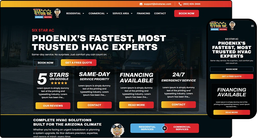
After
- Structured hero section with visible trust badge, key service message, and CTA
- Grid-based service layout with supporting icons and visuals
- Streamlined navigation with easy access to Services, Financing, and Contact
- Multiple lead capture points including sticky “Book Now” buttons
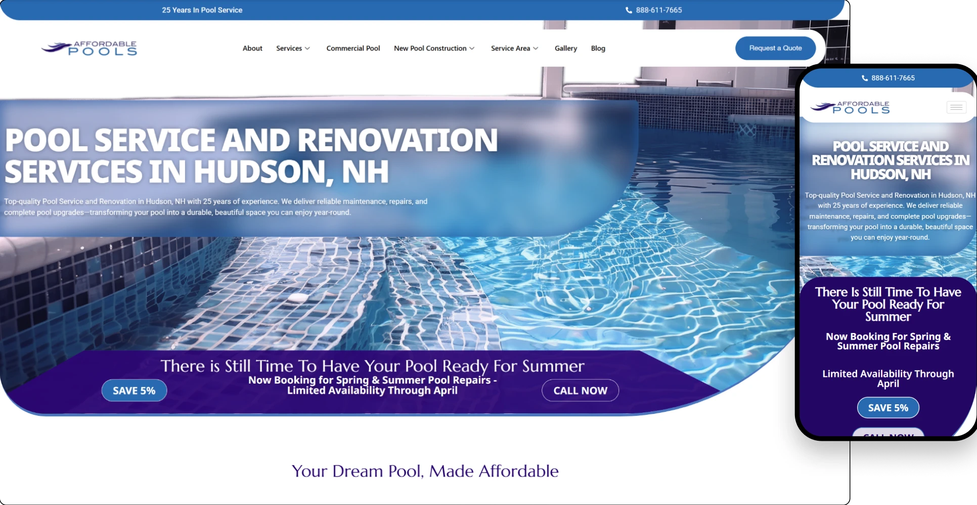
Before
- Outdated Design That Did Not Reflect the Quality of the Work
- Residential and Commercial Services Lacked Clear Separation
- Project Transformations Were Not Presented With Enough Impact
- Service Areas and Company Experience Needed Greater Visibility
- Estimate and Scheduling Calls to Action Were Inconsistent
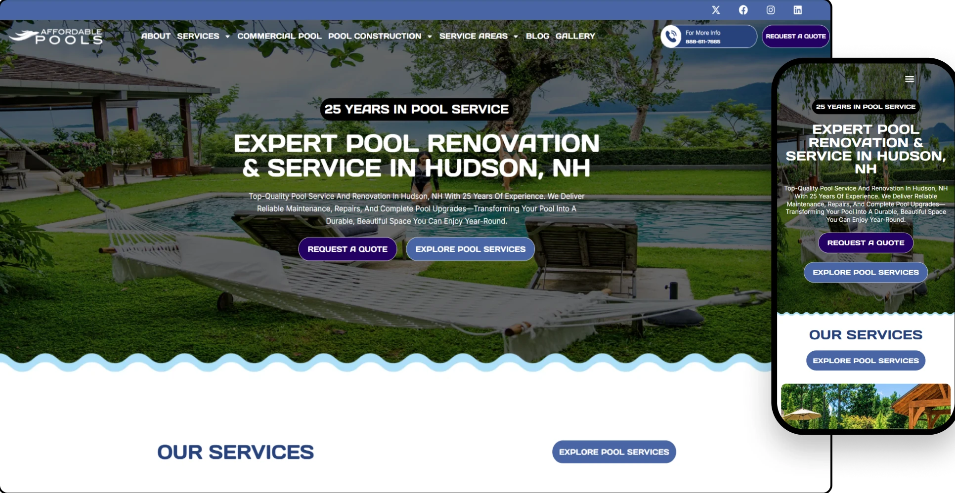
After
- Bold, Pool-Focused Hero With Immediate Quote Options
- Residential and Commercial Services Clearly Categorized
- Before-and-After Gallery Highlights Real Transformations
- Conversion-Focused CTAs and Contact Form Added Throughout
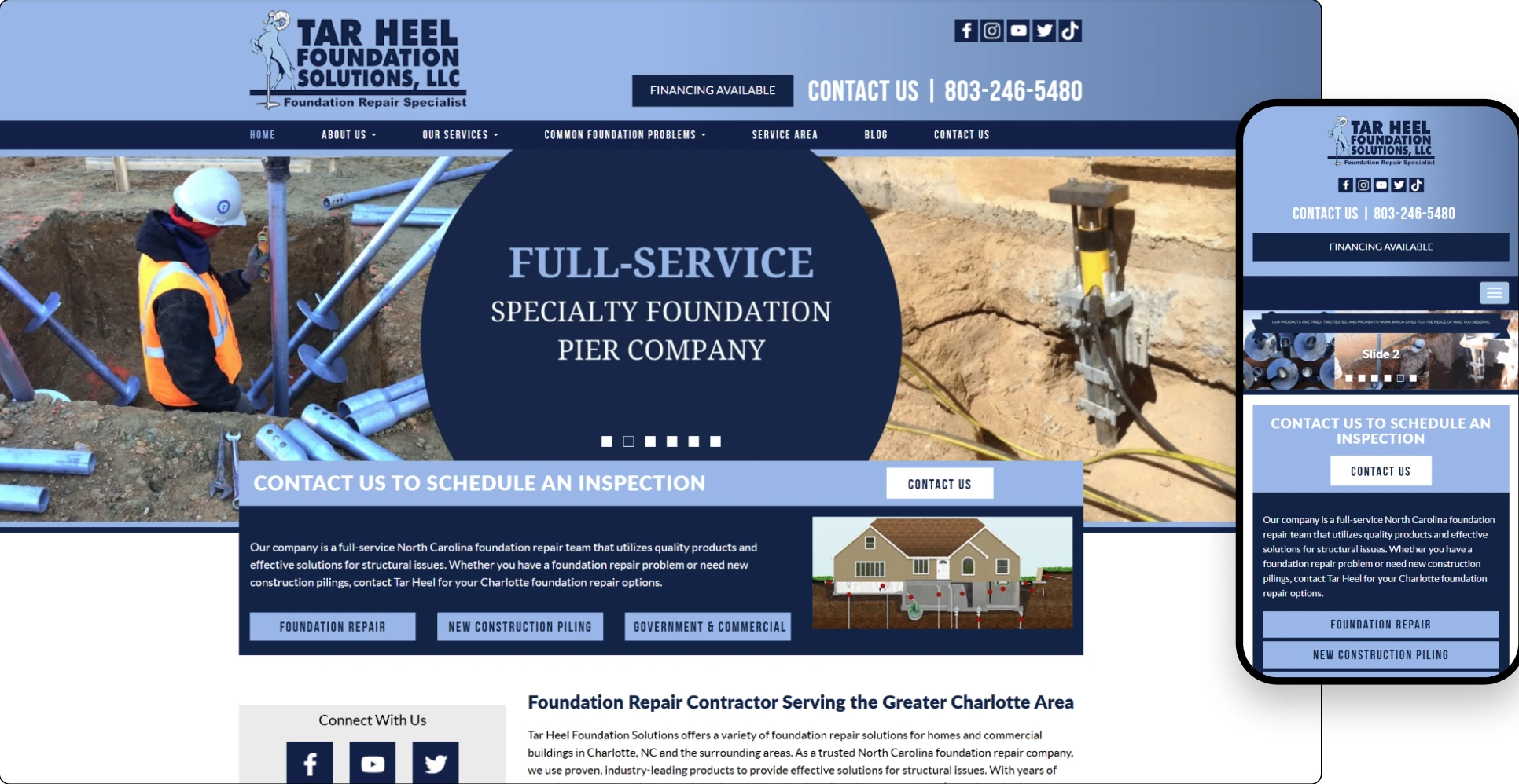
Before
- Outdated Layout With Limited Visual Impact
- Core Services Were Difficult to Differentiate Clearly
- Foundation, Crawl Space and Concrete Solutions Needed Better Structure
- Service Area Coverage Was Not Communicated Strongly
- Calls to Action Lacked Consistent Placement and Clarity
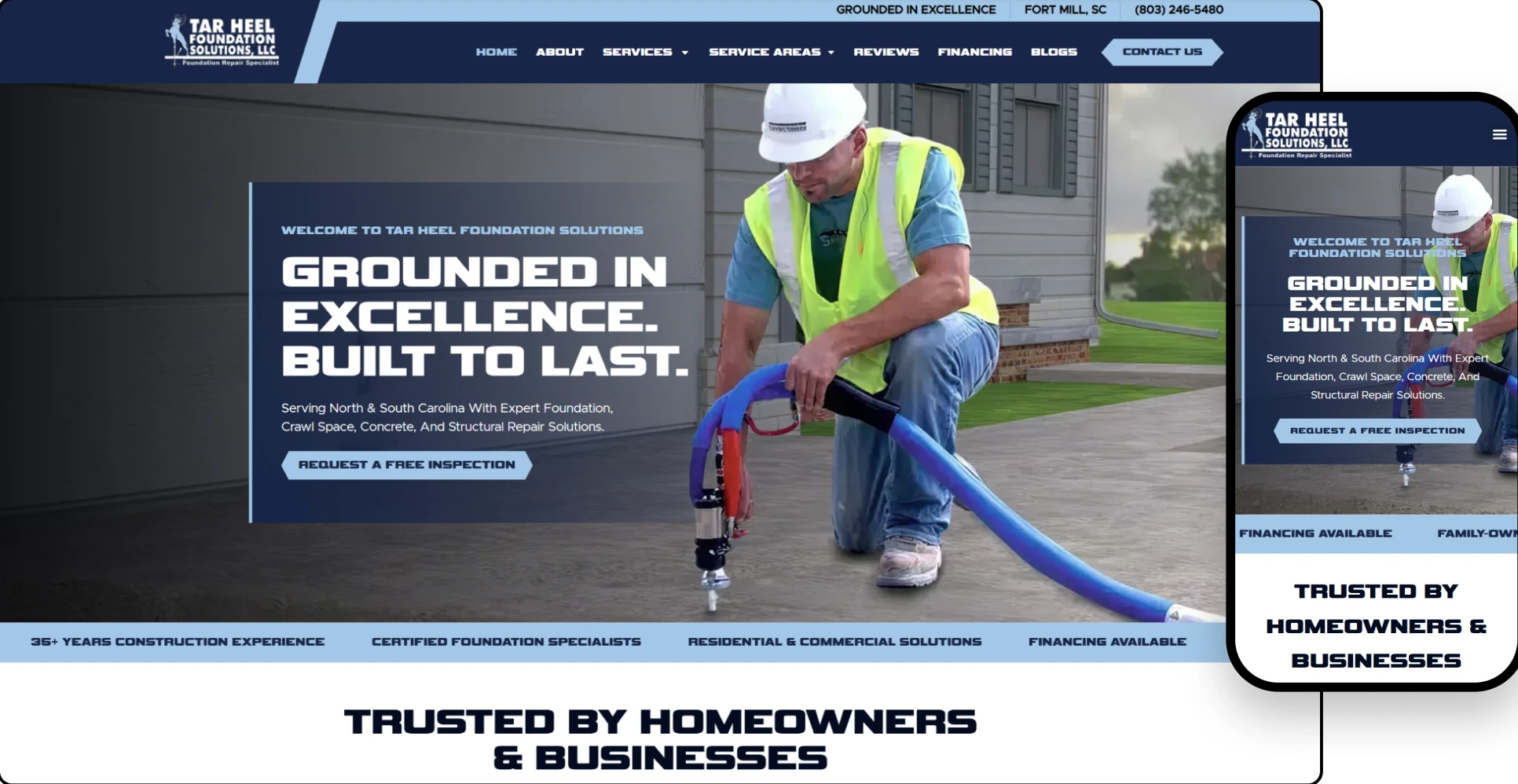
After
- Modern Homepage With Stronger Brand Presentation
- Foundation Repair, Crawl Space and Concrete Solutions Highlighted Better
- Stronger Service Area and Local Market Positioning
- Conversion-Focused Calls to Action Throughout the User Journey
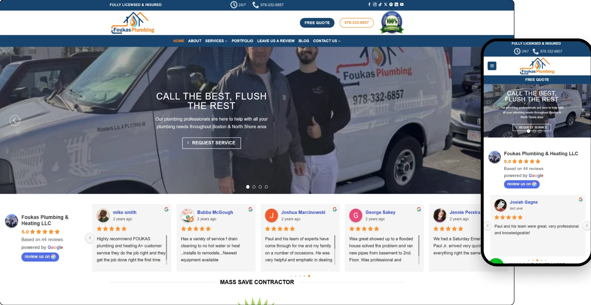
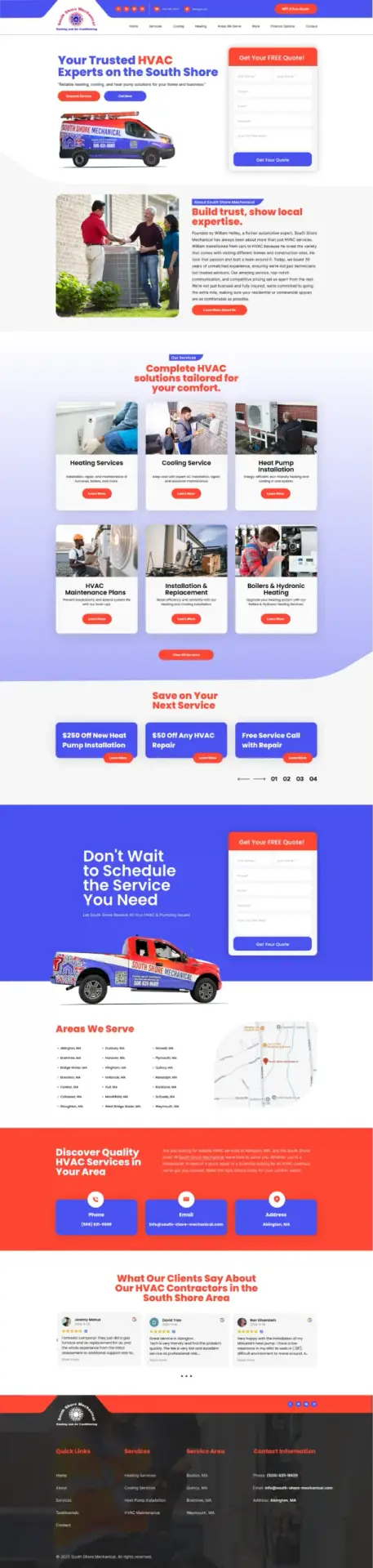
Before
- Outdated Visual Presentation With Limited Brand Consistency
- Plumbing and Heating Services Were Grouped Too Broadly
- Emergency Service and Free Quote CTAs Lacked Prominence
- Heat Pump and Mass Save Expertise Was Underrepresented
- Service Areas and Trust Signals Needed Better Organization
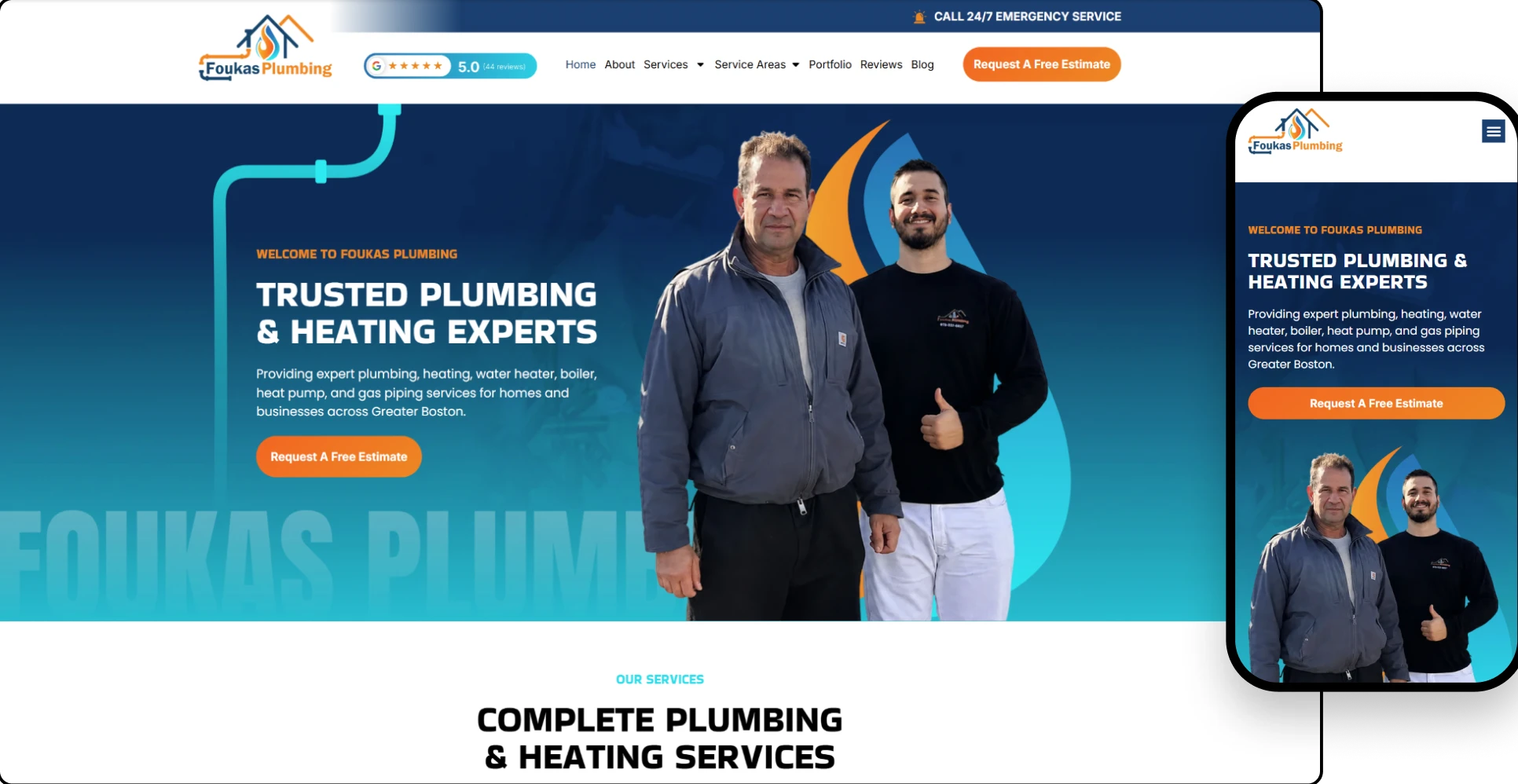
After
- Modern Hero With Clear Emergency and Estimate CTAs
- Complete Services Organized Into Easy-to-Scan Categories
- 40+ Years of Experience and Family Ownership Highlighted
- Dedicated Heat Pump, Mass Save and Water Heater Sections
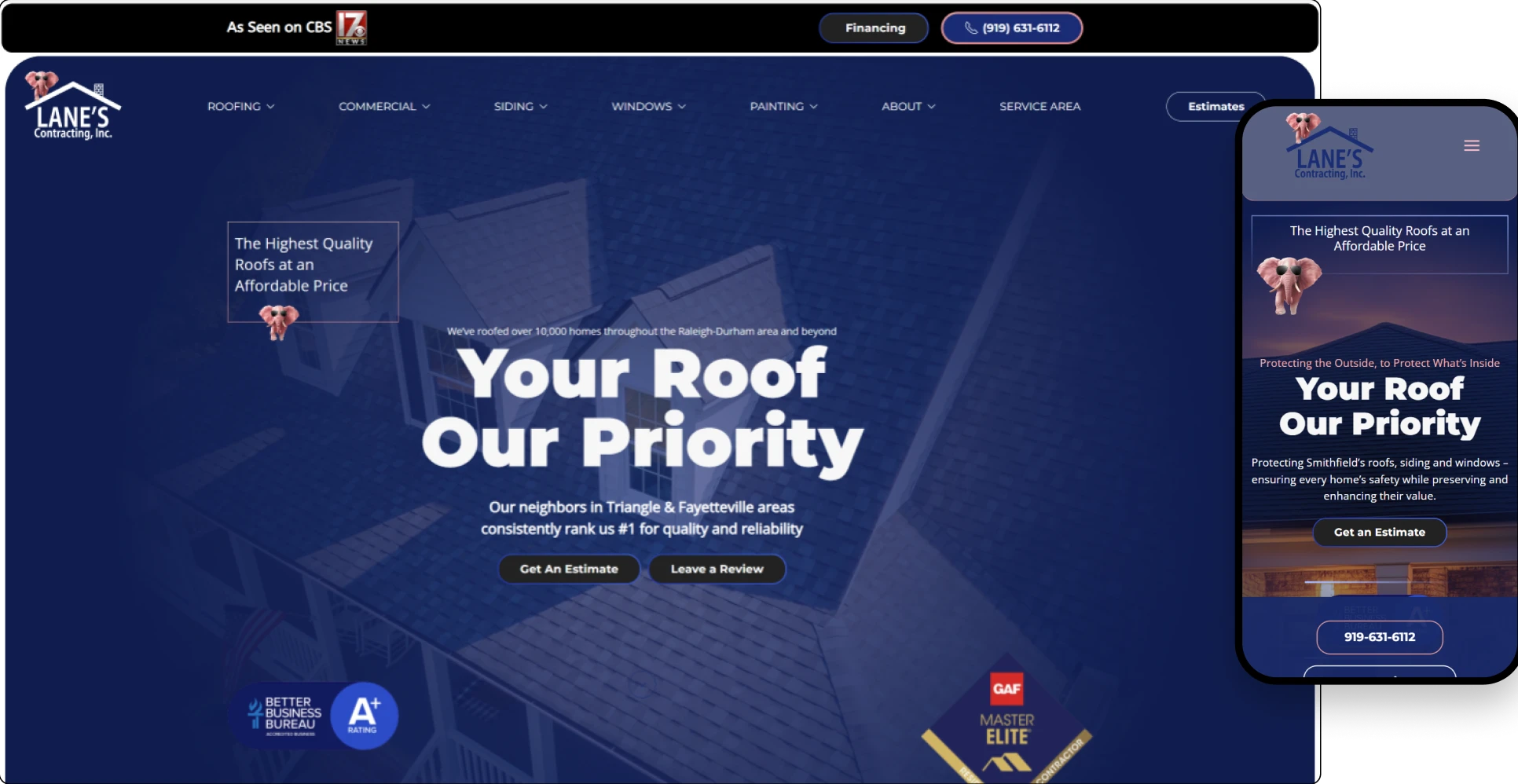
Before
- Generic Hero Messaging That Lacked Brand Personality
- Repetitive Content and Unclear Visual Hierarchy
- Roofing, Siding and Window Services Felt Disconnected
- Credentials, Reviews and Project Proof Lacked Impact
- Inconsistent Calls to Action Across the User Journey
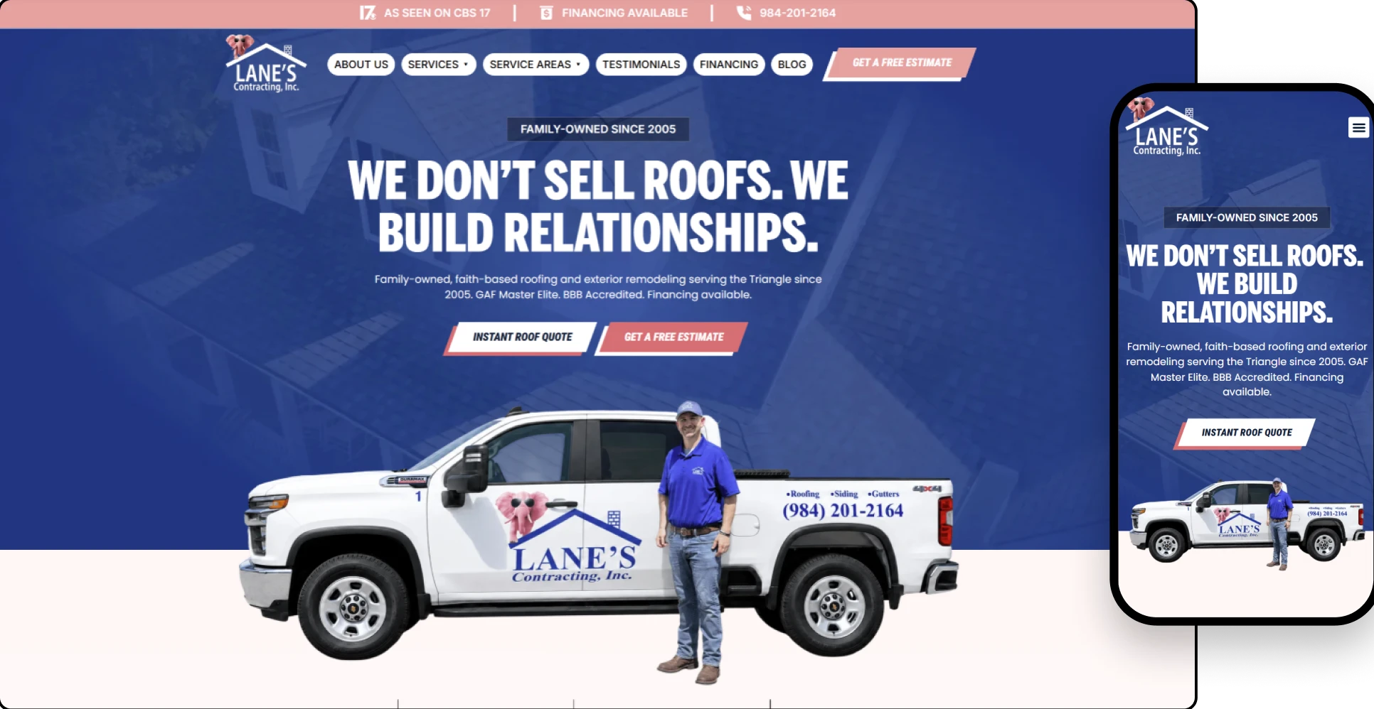
After
- Bold, Relationship-Focused Hero With Strong Brand Imagery
- Roofing, Siding and Window Services Organized Clearly
- Credentials, CBS Feature and Project Results Highlighted
- Consistent Estimate CTAs Built Throughout the Homepage
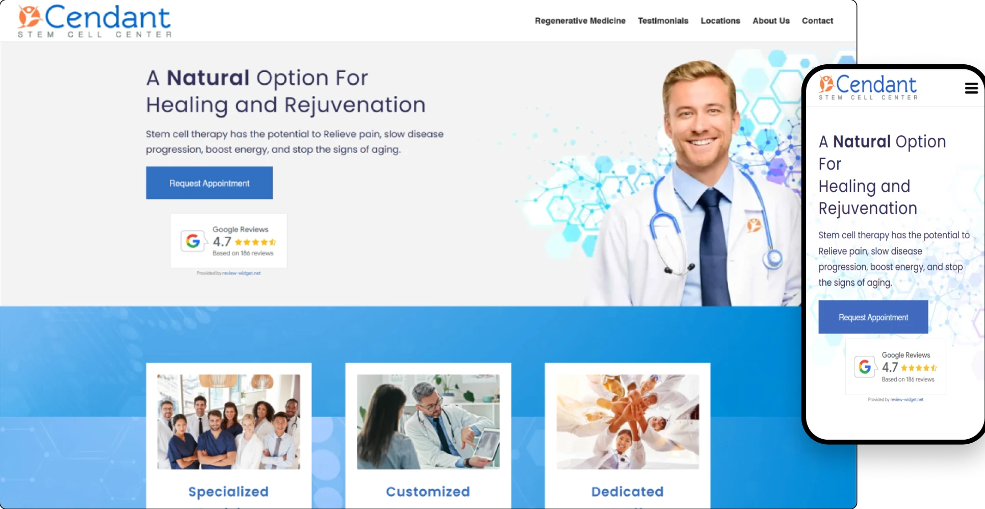
Before
- Outdated Visual Design That Lacked Medical Authority
- Treatment Information Was Dense and Difficult to Scan
- Limited Visual Hierarchy Across Conditions and Services
- Patient Reviews and Success Stories Lacked Prominence
- Contact Journey Needed Clearer Conversion Opportunities
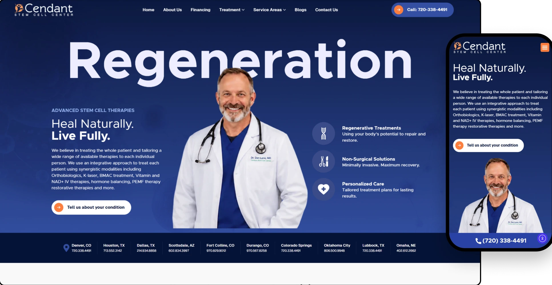
After
- Physician-Led Hero Section Builds Immediate Trust
- Clear Treatment Categories for Different Conditions
- Financing, Video Stories and Reviews Integrated Naturally
- Conversion-Focused Calls to Action and Consultation Form
Before
- A dated and templated design with no brand distinction
- Inconsistent messaging and cluttered layout
- Weak mobile performance and outdated UX
- No visual storytelling or human connection
- Ineffective CTAs and lack of social proof
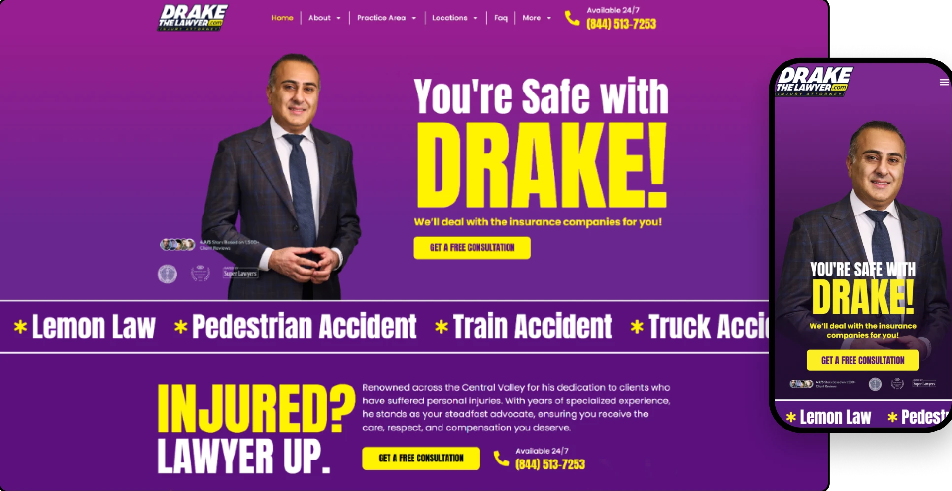
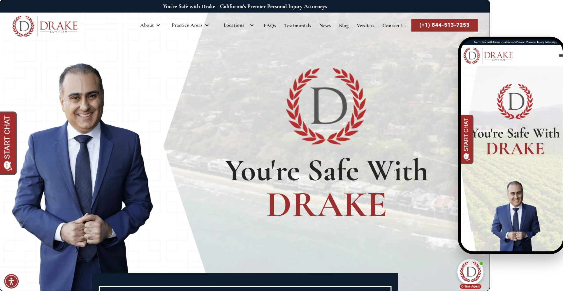
After
- Hero section with a powerful attorney image and confident tagline
- Deep navy & white color palette for legal authority
- Streamlined nav with focus on practice areas and contact
- Lead forms integrated in multiple places
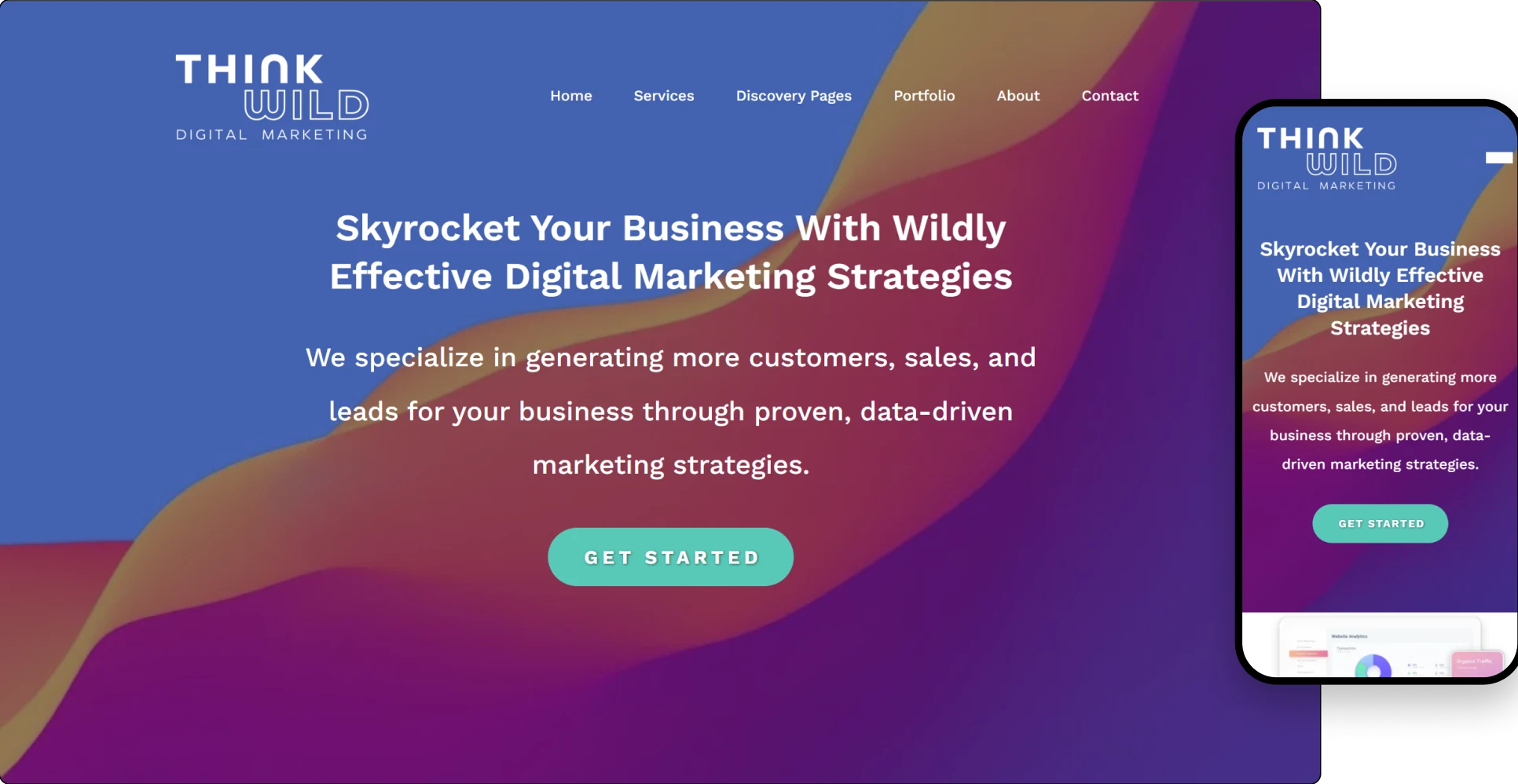
Before
- Visually outdated and lacked cohesion
- Overwhelming with mixed typefaces, colors, and layout inconsistencies
- Poorly optimized for mobile and SEO
- Lacking strong conversion funnels or clear CTAs
- Missing a bold brand narrative that matched their creative mission
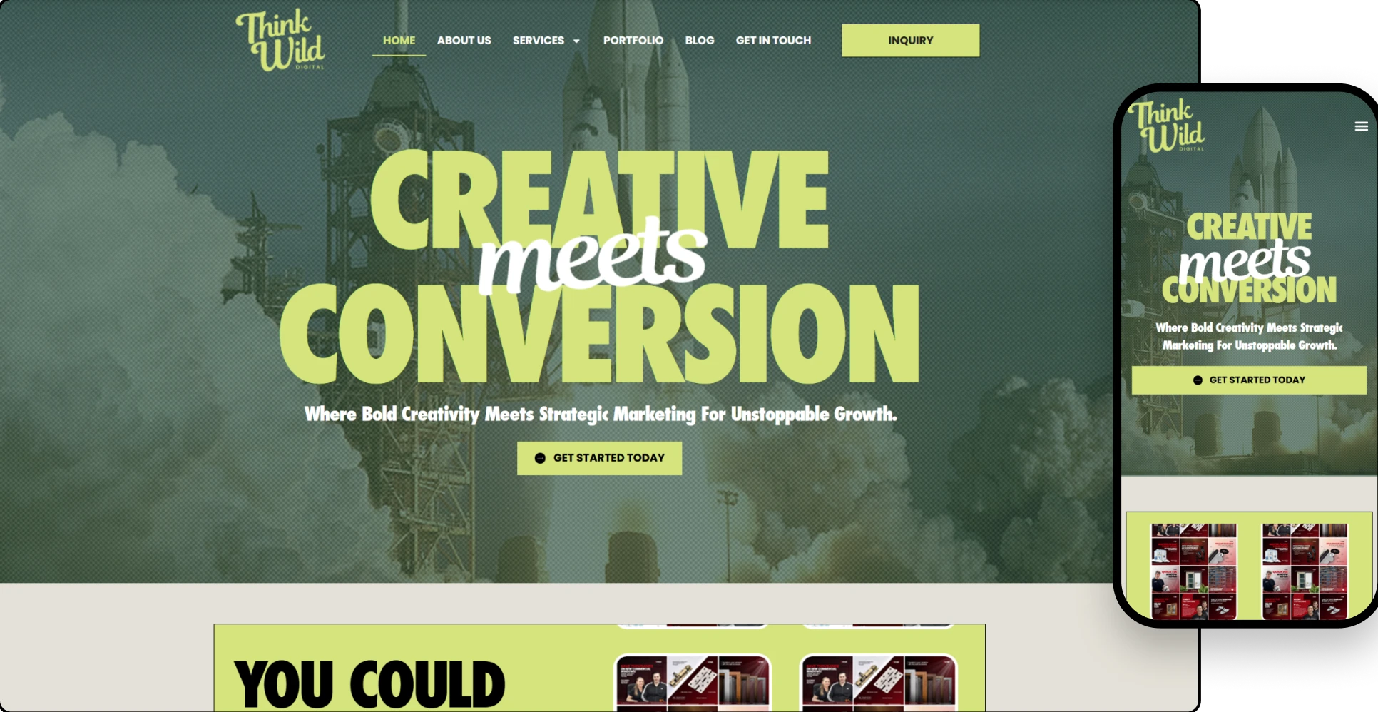
After
- Dynamic hero section with layered text and motion hints
- Showcase of creative work and collaborations
- SEO-friendly structure with well-labeled sections
- Optimized for speed and mobile responsiveness
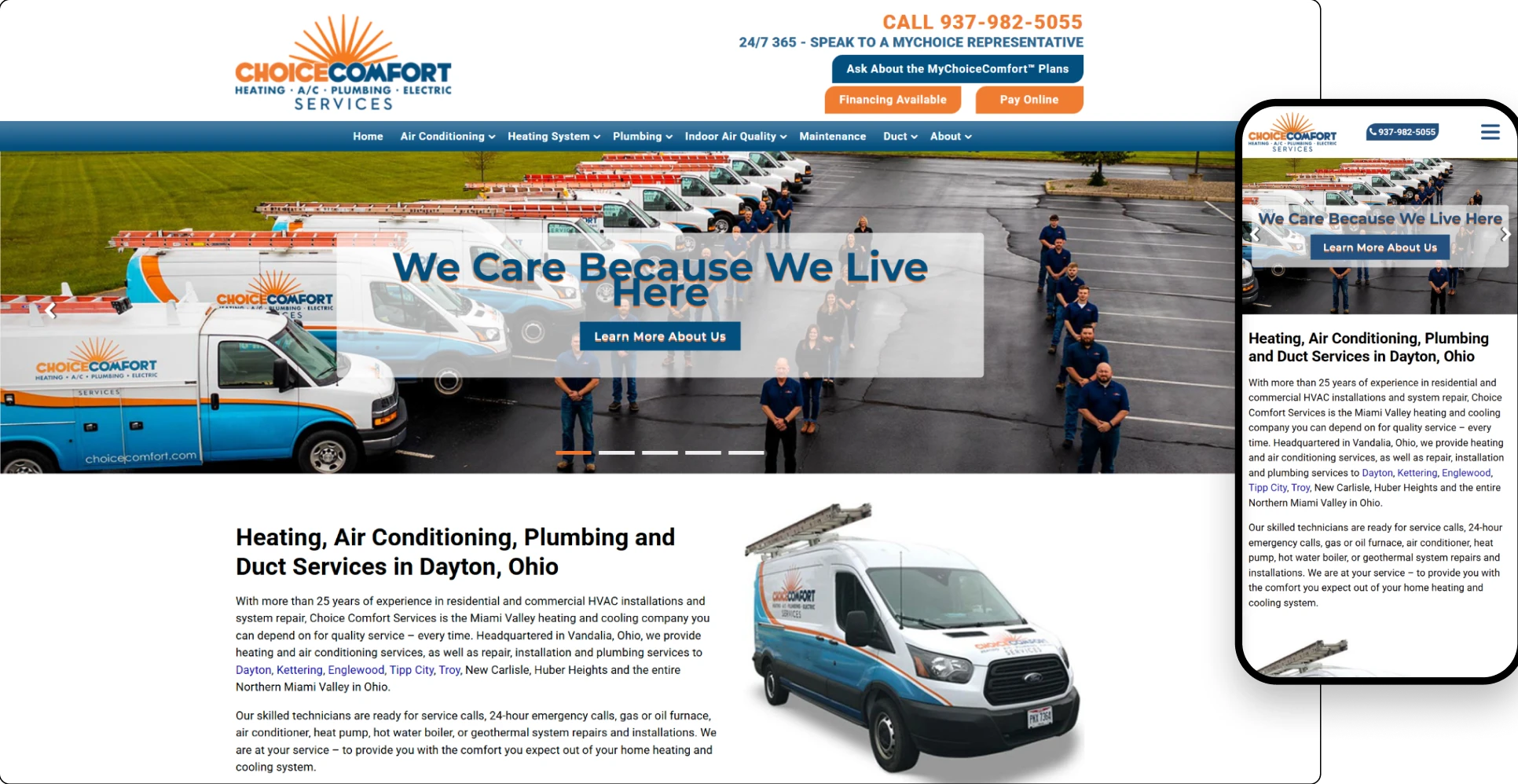
Before
- Outdated design and inconsistent layout
- Poor mobile usability and slow load times
- Low visual engagement and weak branding
- Cluttered navigation with unclear service flow
- Lack of visible trust elements (testimonials, awards, guarantees)
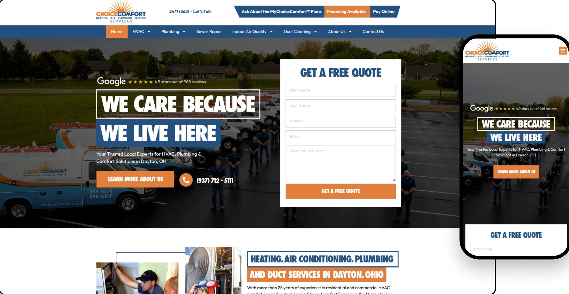
After
- Updated color scheme using navy and orange for a tech-smart, trustworthy vibe
- Modern layout with ample white space and refined fonts
- Fixed navigation bar for easy access
- “Schedule Service” and “Request Estimate” buttons prominently placed
Before
- Outdated visual design that didn’t reflect their premium service
- No clear user flow for service discovery or inquiries
- No mobile optimization
- Weak SEO structure and poor use of visual assets
- Lacked portfolio, testimonials, and product catalog visibility
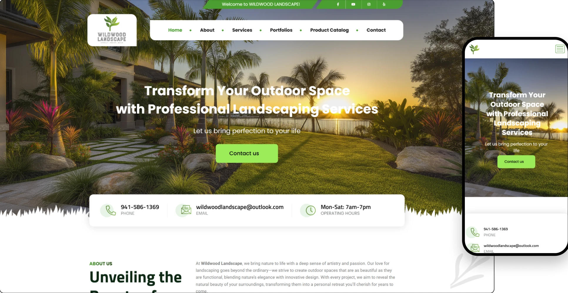
After
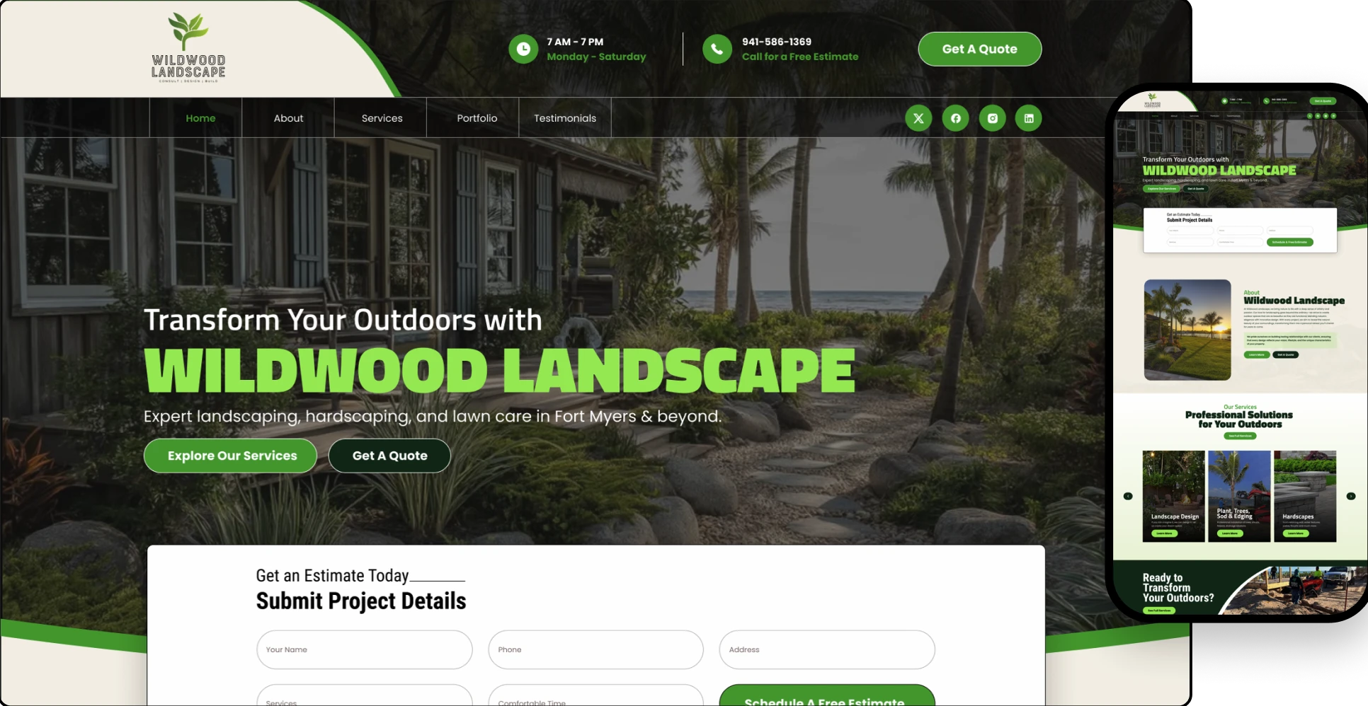
The redesigned site is bold, structured, and built to drive conversions.
- Scroll-friendly layout with sticky nav
- Portfolio and testimonial integration
- “Get a Quote” buttons positioned contextually
- Mobile-first adaptive design





If you’re ready for a website that actually helps you grow, let’s talk.